Graphs and charts are powerful tools in statistics. They help us to understand and explain data quickly and clearly. When data is shown visually, it becomes easier to identify patterns, trends, and comparisons.
In this article, we’ll learn about the main types of graphs and charts, when to use them, and how they help in interpreting statistical information.
✅ Why Use Graphs and Charts?
- To summarize large data sets
- To compare data easily
- To spot trends and patterns
- To communicate results clearly
- To support data-driven decisions
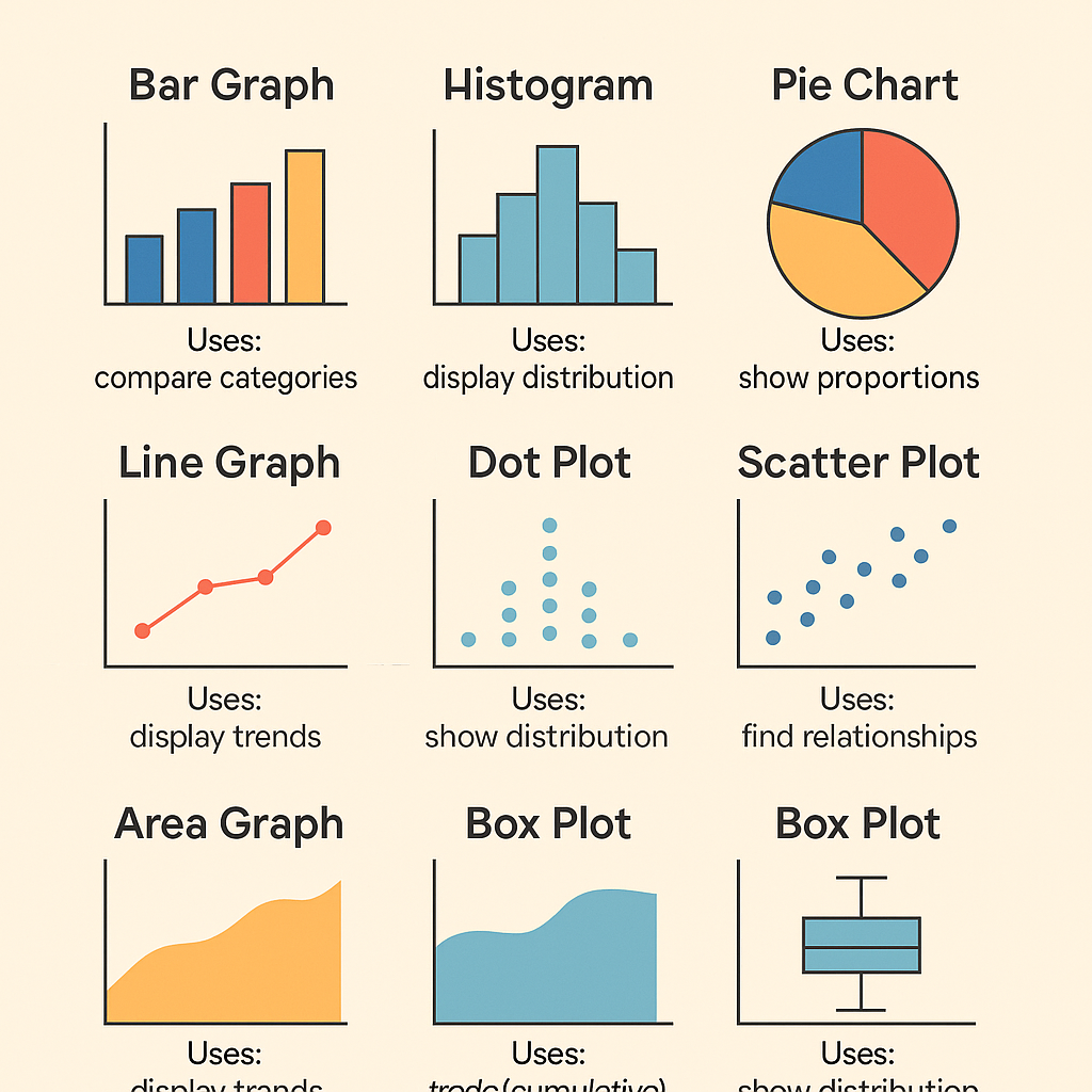
✅ 1. Bar Graph (Bar Chart)
A bar graph uses rectangular bars to show the frequency or value of different categories.
🔹 Features:
- Bars can be vertical or horizontal
- Height/length shows the value
- Best for categorical data
🔹 Example:
Survey showing favorite fruits among students:
- Apples: 20
- Bananas: 35
- Oranges: 25
🔹 Use:
- Comparing categories (e.g., sales by region, population by country)
✅ 2. Pie Chart
A pie chart is a circular chart divided into sectors, where each sector represents a proportion of the whole.
🔹 Features:
- Shows percentage share
- Circle = 100%
🔹 Example:
Market share of companies:
- Company A: 40%
- Company B: 30%
- Company C: 30%
🔹 Use:
- Showing part-to-whole relationships
✅ 3. Line Graph
A line graph displays information as a series of data points connected by straight lines.
🔹 Features:
- Used for continuous data
- Best for showing trends over time
🔹 Example:
Temperature changes over a week
(e.g., Day 1 to Day 7)
🔹 Use:
- Stock market trends
- Website traffic
- Monthly sales
✅ 4. Histogram
A histogram looks like a bar graph but is used for continuous data. The bars touch each other to show the range of data.
🔹 Features:
- Shows frequency distribution
- X-axis = data intervals
- Y-axis = frequency
🔹 Example:
Distribution of student test scores:
0–10, 11–20, 21–30, etc.
🔹 Use:
- Analyzing data distribution
- Understanding how values are spread
✅ 5. Scatter Plot
A scatter plot uses dots to represent the values of two different variables.
🔹 Features:
- Each point = one observation
- Shows relationship/correlation
🔹 Example:
Hours studied vs. test scores
🔹 Use:
- To find correlations between variables
(e.g., height vs. weight, income vs. spending)
✅ 6. Box Plot (Box-and-Whisker Plot)
A box plot shows the spread and distribution of data using five-number summary:
Minimum, Q1, Median, Q3, Maximum.
🔹 Features:
- Identifies outliers
- Displays range and quartiles
🔹 Example:
Visualizing student scores
🔹 Use:
- Comparing distributions
- Analyzing data variability
✅ 7. Area Chart
An area chart is similar to a line graph but with the area below the line filled in with color.
🔹 Features:
- Shows change over time
- Displays cumulative data
🔹 Use:
- Showing total sales, growth, or volume
(e.g., revenue growth over years)
✅ 8. Pareto Chart
A Pareto chart is a combination of a bar and line graph, arranged in descending order.
🔹 Features:
- Highlights most important factors
- Based on Pareto principle (80/20 rule)
🔹 Use:
- Quality control
- Identifying major problems
✅ Comparison Table of Graphs & Charts
| Graph/Chart | Best For | Data Type |
|---|---|---|
| Bar Graph | Comparing categories | Categorical |
| Pie Chart | Showing proportions | Categorical |
| Line Graph | Trends over time | Continuous |
| Histogram | Frequency distribution | Continuous |
| Scatter Plot | Showing relationships | Numerical |
| Box Plot | Distribution and outliers | Numerical |
| Area Chart | Trends and total values | Continuous |
| Pareto Chart | Prioritizing causes/problems | Categorical |
✅ Choosing the Right Graph
| Situation | Recommended Chart |
|---|---|
| Compare student grades in subjects | Bar Graph |
| Show company market share | Pie Chart |
| View monthly website visitors | Line Graph |
| Analyze age group distribution | Histogram |
| Study link between income & education | Scatter Plot |
| Check range of marks in an exam | Box Plot |
✅ Common Mistakes to Avoid
❌ Using 3D charts unnecessarily
❌ Mislabeling axis or scales
❌ Using too many colors or styles
❌ Choosing the wrong chart for data type
❌ Not explaining the chart in text
✅ Conclusion
Graphs and charts are essential tools in statistics. They help in simplifying data, making it more understandable and visually appealing. Choosing the right chart depends on your data and what you want to show.
Whether you are analyzing business data, academic results, or survey responses — using the correct graph will improve your analysis and presentation.